


Testimonials

Kate is an incredible artist with a fantastic personality to match. We have worked with her on a variety of projects, and for each one she comes up with a unique style and vision. She is able to handle the most minute details on a piece but also tackle large concepts for a series of pieces and execute seamlessly. Her mastery of color is also really amazing – the nuances in her color palettes are so subtle yet impactful. In addition, she is great to laugh with and work with, an added bonus

We knew we loved Kate Blairstone’s work as soon as we saw it but were really floored when we met her in person. She immediately grasped the overall concept we were looking for (she understood it better than we did) and made our space more beautiful than we could have ever hoped. She is professional but with a very personal touch, extremely communicative and timely and a joy to work with.

Kate Blairstone’s dreamy artwork is gorgeous enough to line the walls of a posh upscale hotel or the cover of any glossy magazine in equal measure. Bright colors and her engaging interests combine to make for spellbinding pop art. Plus, she’s an absolute pro to work with. I’m so thankful to have stumbled on her work.
Founder and Publisher
Kitchen Table Magazine

We have enjoyed collaborating with Kate in a few different capacities. One project example was a commission for a multi-version wallpaper for a hotel that she was game to research along side our Creative Director for inspiration. She delivered designs beyond our wildest dreams that not only showed creativity and passion, but also consideration for the interior design and brand. Another project we rallied her for had a lot more specificity in the deliverable and style and occasionally multiple rounds of revisions for the client. She consistently responded to those requests with grace and urgency. Kate is a trusted creative resource that we feel fortunate to have.
Kate's work on the color palette at The Solo Club was outstanding - striking the perfect tone for what we were looking to express in ambience and ethos. The relaxed yet sophisticated look and feel of our bar is due in no small part to Kate's sensibilities and eye for detail. From the menu illustrations to the mosaics at each of our entrances, the continuity of "brand" aesthetic and old world charm continues to draw acclaim and invoke delight. We have a lot for which to thank Kate and would work with her again in a heartbeat.
Director of Operations
The Solo Club + Besaw's
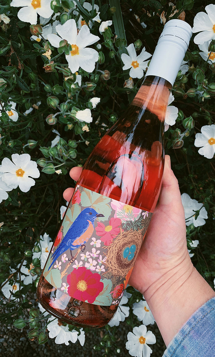
After seeing Kate’s beautiful work around Portland, I knew she was the artist for our rosé of pinot noir label re-design. Following our vineyard walks and chats, Kate was able to capture all of the things we love most about our estate property and the flavor profiles of the wine. Her signature color and pattern illustration earned us extensive positive feedback from distributors and customers nationwide. In fact, we sold out of the entire vintage just a few weeks after bottling. Good design sells and that was exactly our point!
Kate is an absolute dream to work with. She easily translated our brainstorming sessions into an exquisite custom packaging design. Her attention to detail and color mixing skills are sophisticated, timeless and breathtaking.
Founder at Michele Holmes Studio
Rye Beauty